


Microsoft Launcher
Microsoft Corporation
I spent time using Microsoft Launcher as the home screen and organization layer on an Android phone, and my first impression was that it is less about flashy decoration than about reducing the number of steps between picking up the phone and getting something done. It comes from Microsoft Corporation, belongs to the personalization category, and is free to use. That combination makes it easy to try, but its real value depends on whether you want your home screen to behave like a carefully arranged workspace rather than a simple grid of app icons.
The app has been around since October 28, 2015, and its maturity shows in the way it blends appearance controls with practical shortcuts. It is available for devices running Android 7.0 or later, carries an Everyone age rating, and the current version is 6.260402.0.1178950. Those details matter when deciding whether an older phone can run it, but the more important question is personal: do you want a launcher that helps organize information, or do you mainly want a lightweight replacement for your phone’s default screen?
Where Microsoft Launcher Usually Feels Stuck
The most common friction appears during the first transition from the phone’s original launcher. Android normally asks you to choose which home app should handle the Home button, and that choice can be easy to overlook. If the system keeps returning to the old layout, the problem may not be the launcher itself; the default home-app setting may simply still point elsewhere. I recommend checking that setting before reinstalling anything or rebuilding your pages.
Another point of confusion is that a launcher does not replace the entire operating system. It controls the home screen, app drawer, widgets, icon arrangement, search entry points, and related personalization areas, but it does not automatically change every part of Android. Settings screens, notification behavior, lock-screen controls, and manufacturer-specific menus can still look and work exactly as they did before. Expecting one app to redesign all of Android is a quick way to think something is broken when it is actually outside the launcher’s role.
I also found that a familiar home screen can feel less familiar for the first few minutes. The layout encourages you to decide which apps deserve a permanent place, which belong in folders, and which are better reached through search. That is useful once arranged, but it can feel slower if you prefer to tap through several pages without thinking about organization. The app rewards a deliberate setup rather than an instant, untouched replacement.
Related News

Why WhatsApp Messenger Still Makes Everyday Communication Feel Easy

Jurassic World: The Game Is the Better Dino Tycoon for Strategic Players

Threads in Real Life: Who Should Join, Lurk, or Leave

How SHEIN Turned Shopping Into an Endless Content Feed

How to Make Fortnite Feel Smarter on Mobile

Should You Switch to Microsoft Outlook on Mobile?
Widgets can create another small obstacle. A widget may need to be added again after changing launchers, and its appearance can depend on the widget provider rather than the launcher. If a calendar, weather, or productivity widget looks different from before, that does not necessarily indicate a launcher failure. The launcher provides the surface where the widget sits, while the widget’s own app controls much of its content and behavior.
Search is also worth testing instead of assuming it will match the phone’s previous search experience. A launcher’s search entry point can feel different from the manufacturer’s version, especially if you are accustomed to reaching contacts, settings, or apps through a particular gesture. I would spend a few minutes trying the actions I use most: finding an installed app, opening a contact, and reaching a frequently used setting. That simple test tells you more than judging the first screen visually.
What I check before blaming the launcher
When an icon seems to have disappeared, I first check whether it was removed from the home screen rather than uninstalled. The app drawer is the better place to confirm whether the application is still present. This distinction is important because a tidy home screen can make it look as if an app has vanished, when it has only been removed from the shortcut area.
Gallery
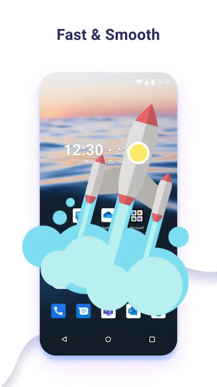
I also check whether a folder or page is hiding the shortcut. A launcher makes it easy to create a cleaner arrangement, but that cleanliness can work against you if you forget where an app was placed. My practical approach is to keep only the apps I use several times a day on the main page, then use folders for related tasks such as travel, payments, reading, and communication. That makes recovery easier when I cannot remember an exact location.
If the Home button opens the wrong screen, I verify the default launcher setting. If a widget is blank, I open the widget’s original app and check whether it works there. If a notification shortcut does nothing, I test the underlying app directly. These checks separate launcher problems from ordinary Android or app-specific issues and prevent unnecessary resets.
Setup Checks That Save Time Later
I recommend beginning with a simple layout instead of trying to recreate every detail of the previous home screen immediately. Put the phone, messaging, camera, calendar, and most-used work or travel apps where your thumb naturally reaches them. Then use the next page for less frequent tools. This gives you a usable arrangement quickly and leaves room to learn which parts of the launcher genuinely improve your routine.
The most useful setup decision is whether to treat the home screen as a dashboard. I prefer a compact first page with a small number of shortcuts and one or two carefully chosen widgets. A crowded page may look productive, but it makes scanning harder and increases the chance of opening the wrong app. Microsoft Launcher works best when the layout reflects actual habits rather than every app installed on the phone.
Take time to review the launcher’s personalization controls after the basic layout is stable. Backgrounds, icon presentation, folders, and page arrangement can be adjusted without rebuilding the entire phone. I would change one visual element at a time, because changing everything at once makes it hard to identify which setting improved or worsened the experience. The goal is not simply to make the screen look different; it is to make frequent actions easier to recognize.
One useful workflow is to separate “launch” shortcuts from “information” widgets. A shortcut should take you directly to an action you perform often. A widget should answer a question without requiring another tap, such as what is scheduled next or whether something needs attention. If a widget does not save time, I remove it. This keeps the home screen from becoming a decorative noticeboard that still requires opening several apps.
People often ask whether this launcher is suitable for an older Android phone. The stated minimum is Android 7.0, so a device below that requirement is not a candidate. On a compatible phone, I would still keep expectations realistic: the experience can be affected by the device manufacturer, available memory, the number of widgets, and the behavior of other installed apps. Compatibility is necessary, but it does not guarantee that every phone will feel equally responsive.
The free price makes experimentation straightforward, and the Everyone rating makes it broadly approachable for ordinary household use. Still, free does not mean every user will prefer it. Someone who wants the smallest possible change may be happier with the built-in launcher, while someone who wants Microsoft-oriented organization may find the extra structure worthwhile.
My setup routine for a cleaner first page
I choose the launcher as the default home app and press the Home button several times to confirm that the choice persists.
I place only essential shortcuts on the first page, leaving enough empty space to make the layout easy to scan.
I add one widget that supports a real daily task, then remove it if it adds visual noise without saving a step.
I test the app drawer and search with apps that are not on the first page, because those are the places I rely on when I deliberately keep the home screen minimal.
I restart the phone once after arranging everything, then check the Home button, widgets, folders, and notifications before considering the setup complete.
This routine is deliberately boring, but it prevents a common mistake: spending time on colors and icons before confirming that the basic navigation works. A launcher should first be dependable, then attractive.
Recovering a Workflow When Something Changes
Launcher changes become most noticeable during a busy day. Imagine leaving home for work, reaching for a calendar shortcut, and finding that the page arrangement no longer matches your muscle memory. The fastest recovery is not to redesign the entire screen. I would open the app drawer, locate the needed app, and place a fresh shortcut in a temporary, obvious position. Once the urgent task is finished, I could decide whether the original organization was actually useful.
If a shortcut opens an unexpected screen, I test the app from the drawer first. That tells me whether the issue is the shortcut or the application. I then remove and recreate the shortcut rather than repeatedly tapping it and assuming the launcher is remembering the wrong command. This is especially helpful after an app changes its own internal navigation.
For a missing widget, I check three layers: whether the widget is still placed on a page, whether the source app opens normally, and whether the widget’s content updates when opened directly. A launcher can host the widget, but it cannot repair a source app that is not loading its own information. Re-adding the widget is reasonable after those checks, but I would not reset the whole launcher for a single blank panel.
Folders deserve a little planning. I use names based on tasks rather than brands, because “Bookings” or “Bills” tells me why I need the folder. This is a small but non-obvious advantage of a structured launcher: the home screen can reflect how I think about activities, not just how the app drawer lists software. The trade-off is that a folder adds a tap, so I keep direct shortcuts for anything I open repeatedly throughout the day.
There is also a useful distinction between a launcher backup or restoration workflow and ordinary screen arrangement, but I would approach any migration carefully and verify what has actually returned before deleting the previous setup. Rebuilding a layout is manageable; discovering later that a preferred arrangement or widget placement did not carry over is frustrating. I treat a new launcher as a gradual move, not a single irreversible switch.
Users sometimes ask whether Microsoft Launcher will preserve every detail from another launcher. I would not assume that. Different launchers organize pages, folders, gestures, widgets, and search differently. Even when the same apps are installed, their positions and behaviors may need to be recreated. The safest plan is to photograph or note the old layout, then rebuild only the parts that genuinely support your routine instead of attempting a perfect visual copy.
When a reset is reasonable
A reset makes sense when several parts of the layout behave inconsistently and ordinary checks have not helped. Before doing that, I would record the arrangement I want to keep and confirm that important apps and widgets work independently. Resetting for one misplaced icon is excessive; resetting after a messy migration can be practical. The key is to use it as a controlled cleanup step rather than the first response to every small problem.
I would also avoid changing multiple system-level settings at the same time. If I switch the default launcher, alter battery behavior, remove a widget, and change notification settings in one session, I lose the ability to identify the source of a later problem. A staged approach takes a little longer but produces a more reliable result, especially on phones with heavy manufacturer customization.
When the App Is Not the Cause
Some complaints that appear to involve the home screen originate elsewhere. A phone that feels slow may be dealing with limited storage, a demanding background process, or a system update. A delayed notification may be controlled by the messaging app or Android’s power management. A widget that shows old information may depend on its provider’s refresh behavior. In each case, the launcher is only the place where the symptom becomes visible.
Battery concerns should be judged carefully as well. A launcher remains active because it is responsible for the home screen, but the overall effect of a particular setup depends on widgets, animated elements, background services, and the device itself. If battery life changes, I would compare the phone with unnecessary widgets removed and with the same everyday usage pattern. That is more useful than assuming the launcher alone explains every difference.
Manufacturer interfaces can also create confusing overlaps. Some phones include their own gesture navigation, app suggestions, edge panels, or home-screen tools. Microsoft Launcher may coexist with those features, but the result can feel inconsistent if several systems are trying to provide similar shortcuts. When that happens, I simplify: I keep the launcher’s home-screen tools I actually use and disable or ignore duplicate surfaces where the phone allows it.
Privacy-conscious users should make their own comfort decision based on the services they choose to use. A launcher sits close to the apps and information a person accesses from the home screen, so I would review the app’s settings and avoid enabling features that do not serve a clear purpose. The practical principle is simple: use personalization and organization features intentionally, rather than turning on every available option just because it is present.
Who should skip it? I would hesitate to recommend it to someone who is perfectly happy with the manufacturer’s launcher, dislikes reorganizing a phone, or wants a minimal interface with almost no adjustment period. It may also be the wrong choice for a person who expects a launcher to solve unrelated performance, notification, or app reliability problems. In those cases, troubleshooting the phone or the affected app is the better path.
On the other hand, it suits people who want a more deliberate home screen, regularly switch between personal and work tasks, or prefer reaching information through an organized dashboard. It can also help a family member who finds a carefully arranged layout easier to understand than a long, unstructured app grid. The benefit is not that every screen looks dramatically different; it is that the phone can be arranged around real routines.
How It Compares With the Usual Alternatives
The built-in launcher remains the strongest alternative for simplicity. It is already integrated with the phone, usually requires no migration, and tends to match the manufacturer’s gestures and visual language. If your main goal is reliability with minimal setup, staying with the default option is sensible. Microsoft Launcher becomes more appealing when you want more control over organization and a home screen that feels intentionally arranged.
Minimalist launchers take the opposite approach. They often reduce visual choices and encourage fewer apps, which can be excellent for someone trying to avoid distraction. Microsoft Launcher gives me more room to build a practical dashboard, but that flexibility can also invite over-customization. If I keep adding pages, folders, and widgets, I can create the same clutter I was trying to escape.
Other customization-focused launchers may offer deeper visual experimentation or more specialized gesture controls. That can be better for enthusiasts who want to tune every detail. My view is that Microsoft Launcher is more convincing when the priority is a balanced combination of personalization and everyday organization, not endless visual tweaking. It feels most useful when I make a few thoughtful choices and then stop adjusting.
The app’s broad adoption supports the idea that it is a mature option rather than an obscure experiment: it has a 4.7 average from around 1.7 million ratings and has passed 50 million installs. Those figures do not guarantee that it will suit every phone, but they do indicate that many Android users have found a reason to try it. I treat that as reassurance about its place in the category, not as a substitute for testing it on my own device.
My Practical Verdict After Using It
Microsoft Launcher is a strong choice when I want my Android home screen to act like a personal starting point instead of a passive collection of icons. Its best qualities appear after setup: a clear first page, sensible folders, useful widgets, and search habits that reduce wandering through the app drawer. The experience is especially good for people who enjoy organizing their phone around tasks and want personalization to have a practical purpose.
The main caution is that the first hour can involve more decisions than expected. Default-launcher settings, widget behavior, manufacturer features, and old layout habits can all create friction. I would not judge it before testing the Home button, app drawer, search, folders, and the few widgets I depend on. Those checks reveal whether the launcher fits my workflow far better than a quick glance at its themes or icons.
For my use, the trade-off is worthwhile because I can keep the first page focused and recover quickly when something changes. I would choose the phone’s original launcher for a no-maintenance experience, and a minimalist alternative for a deliberately sparse phone. But for someone who wants a free personalization app that also brings structure to everyday Android use, Microsoft Launcher is worth trying with a measured setup rather than an all-at-once makeover.
My final advice is to install it, make a small working layout, and use that arrangement for several days before adding more decoration. Keep the shortcuts that genuinely save time, remove widgets that only occupy space, and investigate the underlying app whenever a problem appears outside the home screen. Used that way, the launcher feels less like a cosmetic replacement and more like a practical layer between you and the rest of your phone.
FAQs for Microsoft Launcher
What is Microsoft Launcher and what are its main features?
Microsoft Launcher is a customizable Android launcher that integrates seamlessly with Microsoft services. It offers features like personalized news feeds, a customizable home screen, and integration with Outlook, Office, and more. Users can also benefit from a unified calendar, to-do lists, and sticky notes, making it ideal for productivity enthusiasts.
Is Microsoft Launcher compatible with all Android devices?
Microsoft Launcher is designed to work with most Android devices running Android 7.0 (Nougat) and later. However, performance may vary depending on the device's hardware specifications. It's advisable to check the Play Store for specific compatibility details related to your device before downloading.
Does Microsoft Launcher support gesture controls?
Yes, Microsoft Launcher supports a variety of gesture controls to enhance user experience. Users can customize gestures for quick access to apps and functions, such as double-tap to lock the screen or swipe up for app drawer access. This feature allows for efficient navigation tailored to individual preferences.
How does Microsoft Launcher integrate with Microsoft services?
Microsoft Launcher provides seamless integration with Microsoft services like Outlook, OneDrive, and Office. Users can sync their calendar, emails, and documents, offering a cohesive experience across devices. This integration is particularly useful for those who rely on Microsoft’s ecosystem for work or personal use.
Can I use Microsoft Launcher without a Microsoft account?
While you can use Microsoft Launcher without a Microsoft account, logging in with one unlocks its full potential. Features like personalized feeds and syncing across devices require a Microsoft account. It enhances the experience by providing access to a unified ecosystem, making it a worthwhile consideration for users invested in Microsoft services.
Pros
- Smooth integration with Microsoft services.
- Highly customizable home screen layout.
- Efficient performance with low battery usage.
- Easy access to recent activities and tasks.
- Built-in gesture controls for quick navigation.
Cons
- Limited widget options compared to competitors.
- Occasional sync issues with some accounts.
- Requires Microsoft account for full features.
- Some features locked behind Microsoft apps.
- Resource-heavy on older devices.


